
How to Tell AI What Your Website Should Do, Say, and Feel Like
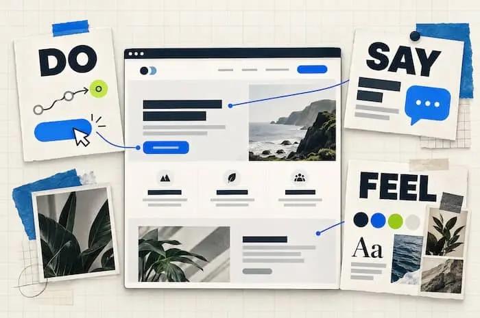
What should your website do? What should it say? And what should it feel like? Those questions help turn a vague idea into decisions an AI builder can act on.
Intro
You’ve asked AI to build a website. It has a headline, some buttons, and a respectable number of rectangles.
But something feels off.
The words could describe any business. The features aren’t quite what your customers need. And the design gives “software startup” when you were aiming for “friendly neighborhood bakery.”
Time for another prompt.
“Make it better.”
Better how?
That’s where a little direction makes a big difference. Before asking for another redesign, explain three things:
What should your website do? What should it say? And what should it feel like?
Those questions help turn a vague idea into decisions an AI builder can act on. You don’t need design vocabulary to answer them. You need to think about the person using your website.
Let’s use a fictional cleaning company, Sunday Reset, to show how it works.
Do: Give your website a useful job
Start by imagining a visitor arriving at your website.
They’re busy. They have questions. They’re probably comparing you with another option. What should your site help them accomplish?
For Sunday Reset, the answer might be:
Help busy homeowners understand our cleaning services, check whether we cover their neighborhood, and request a quote.
That’s more useful than:
Create an impressive cleaning website with lots of features.
“Impressive” could send the builder off to animate a sponge. Meanwhile, the visitor still can’t find the service area.
Choose features by the problem they solve
Before requesting a feature, finish this sentence:
“This helps the visitor…”
For example:
| Feature | This helps the visitor… |
|---|---|
| Service-area checker | Find out whether the company serves their neighborhood. |
| Service comparison | Understand the difference between recurring and deep cleaning. |
| Quote form | Request pricing without making a phone call. |
| “What’s included” checklist | Know what they’re paying for. |
| Booking calendar | Choose an available appointment, if online booking is supported. |
If you can’t explain the benefit, pause before adding the feature.
A customer dashboard might be useful later. It probably doesn’t need to be your first project when the immediate goal is getting quote requests.
Describe what happens - not just what appears
“Add a quote form” describes an object.
A better instruction describes the experience:
Add a quote form that asks for ZIP code, home size, cleaning type, name, and email. Explain why home size is needed. Show clear messages for missing information. After a successful submission, confirm that the request was received and explain the next step using our approved response-time wording.
You should also tell the builder where the submission goes. If that connection hasn’t been decided, ask it to flag the unfinished setup.
A form that looks beautiful but sends inquiries nowhere is a very fancy suggestion box.
Try this prompt:
Our main website goal is [goal]. Visitors need to [task] before they can confidently [action]. Recommend the simplest features that support that journey. Explain the visitor benefit of each, and separate essentials from optional additions.
Say: Explain why anyone should care
Once you know what the website should do, decide what visitors need to hear.
AI can produce sentences quickly. It needs your help choosing the right message.
For Sunday Reset, “professional cleaning solutions” technically describes the service. But it doesn’t tell a tired homeowner much.
A more relevant message might be:
Come home to a clean house—and keep your weekend.
That connects the service to something the customer wants.
Separate the feature from the benefit
A feature describes what you offer.
A benefit explains why it matters.
| Feature | Customer benefit |
|---|---|
| Recurring cleaning | Fewer household chores to fit into the week. |
| A clear cleaning checklist | An easier way to understand what the service includes. |
| Online quote requests | Start an inquiry when it suits you. |
| Appointment reminders | Less chance of forgetting an upcoming visit. |
Give AI both sides. Otherwise, it may produce a list of features and leave visitors to work out the value themselves.
Be careful with promises. “Flexible scheduling” should only appear if the business genuinely offers it. “Save ten hours every week” needs evidence, not enthusiasm.
Give the copy a clear order
Your homepage doesn’t need to say everything at once.
Ask it to answer the visitor’s questions in a useful sequence:
- What do you offer, and is it for me?
- How does it help?
- What’s included?
- Why should I trust you?
- What happens next?
For Sunday Reset, that could mean an opening headline about getting time back, followed by service options, a cleaning checklist, genuine customer reviews, and the quote process.
The order follows the customer’s decision.
Describe your voice with examples
“Friendly” means different things to different people.
Help the builder understand your version:
Write like a helpful business owner speaking to a new customer. Use everyday words, short explanations, and a little warmth. Keep humor out of pricing explanations and form errors.
You can also show the difference:
Prefer: “Tell us a little about your home.”
Avoid: “Initiate your personalized cleaning journey.”
The second one makes booking a cleaner sound like joining a space mission.
Try this prompt:
Our customer wants [outcome] and worries about [concerns]. Our service offers [confirmed features], which help by [benefits]. Write homepage copy that makes those connections clear. Use [voice description]. Flag any claim that needs confirmation.
Feel: Describe the impression, then make it visible
Now for the part that’s easy to describe vaguely.
You want the website to feel welcoming. Or confident. Or playful. Or expensive enough to justify your prices.
Those are useful intentions, but the builder needs to know how to express them.
Pick two or three qualities, then explain what each means.
For Sunday Reset:
| Desired feeling | How the website could express it |
|---|---|
| Calm | Uncluttered sections, comfortable spacing, restrained motion. |
| Trustworthy | Clear service details, readable pricing information, genuine photos and reviews. |
| Warm | Cream backgrounds, natural photography, conversational copy. |
These are design directions to explore, rather than universal rules. Review the result to see whether it creates the impression you intended.
Give the whole experience a personality
The feel comes from more than colors.
A warm-looking website can still feel unfriendly if its form is confusing. A premium website can feel careless if the photos are blurry or the buttons lead nowhere.
Tell AI how the experience should behave:
Keep navigation straightforward. Explain unfamiliar terms. Make the primary action easy to find. Use helpful form messages. Avoid unexpected pop-ups that interrupt someone reading about a service.
Those details contribute to the impression as much as the headline font does.
Use references with a reason
If you have a screenshot you love, explain why.
I like the spacious layout and natural photography in this reference. Adapt those qualities to our content, using our own branding and an original composition.
Without that explanation, the builder might copy the element you barely noticed while missing the thing you actually liked.
Try this prompt:
The website should feel [three qualities]. Express those through typography, color, imagery, spacing, copy, and interactions. Propose specific choices and explain how they support the intended feeling. Keep text readable and important actions obvious.
Make “do, say, and feel” agree with each other
Each part should support the same experience.
Imagine Sunday Reset promises an easy way to get cleaning help, but the quote form asks twenty questions before showing what services are available.
The message says “easy.” The experience says “bring snacks; this may take a while.”
Or imagine a financial consultant seeking a calm, reassuring impression, while every section bounces onto the screen.
The animation is working. The direction needs another look.
Ask AI to check the relationships:
Review the proposed features, messaging, and visual direction together. Identify any choices that conflict with our main goal or intended customer experience. Suggest specific improvements before building.
This is especially useful when you’ve collected ideas from several different websites.
Keep your decisions in a Markdown file
Your earlier brief can hold these decisions too.
A Markdown file is a plain-text document ending in .md. It lets you organize instructions with headings and bullet points. Think of it as a shared reference you can update as the website develops.
Add a section like this to website-brief.md:
## What the Website Should Do
Primary goal:
Help visitors request a cleaning quote.
Essential tasks:
- Check whether we serve their neighborhood.
- Compare recurring and deep cleaning.
- Understand what is included.
- Submit a quote request.
## What the Website Should Say
Main customer benefit:
Spend less of your free time cleaning.
Important concerns:
- What is included?
- How is pricing determined?
- What happens after requesting a quote?
Voice:
Warm, clear, and practical.
Use confirmed facts and flag missing information.
## What the Website Should Feel Like
Qualities:
Calm, trustworthy, and warm.
Design direction:
- Comfortable spacing and readable typography.
- Cream backgrounds with restrained green accents.
- Genuine photography when available.
- Minimal motion and straightforward navigation.
Upload the file, place it in your project, or paste its contents into the builder depending on what your tool supports. Explicitly ask AI to read it before proposing changes.
Review one part before building everything
Once the direction is clear, ask for a small sample: the navigation, hero, and one useful section.
That’s enough to judge whether the builder understands your intent.
Check three things:
- Do: Is the next action obvious and useful?
- Say: Can you understand the offer without translating vague marketing language?
- Feel: Does the combination of words, images, and layout create the right impression?
Give specific feedback:
The headline communicates the service, but it doesn’t explain the customer benefit. Rewrite it around having more free time. Keep the current layout and colors.
Or:
The page feels too formal. Use more conversational copy and warmer photography while preserving the service details and quote process.
Once you approve the direction, record it in your brief and continue with the next sections.
A prompt you can use today
Read my website brief and help me define what this website should do, say, and feel like.
Do: Recommend essential features based on the visitor’s tasks and the website’s primary goal. Explain the benefit of each feature and describe what happens when someone uses it.
Say: Connect our confirmed services or product features to customer benefits. Address important questions and concerns in clear language.
Feel: Propose a visual and interaction direction that expresses our brand qualities while keeping the website easy to use.
Flag missing information and conflicting requirements. Do not invent business facts or promises.
Present the plan first. After I review it, build the navigation, hero, and one supporting section so we can assess the direction.
You don’t have to arrive with every answer. You can ask AI to help you explore options and make decisions.
But when you can explain what your visitors need, what makes your offer useful, and how the experience should feel, you give the builder much better material.
And you give yourself a better way to judge the result than “Hmm. Make it pop?”