
How to Use a Markdown File to Build an AI Website That Looks Like Your Brand
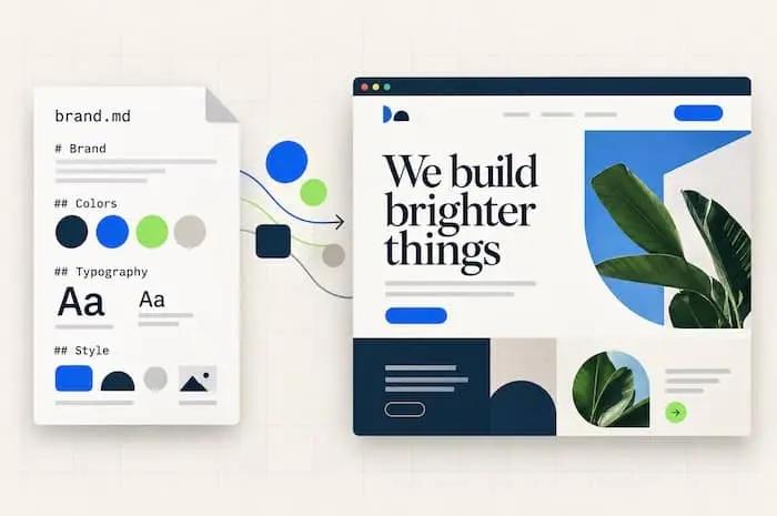
Getting a distinctive website takes more than asking for a better-looking design. You need to explain what makes your business different and give the builder specific directions it can follow.
Intro
You ask AI to build a “modern, professional website.” It gives you a large headline, a gradient background, rounded cards, and a few floating decorative shapes. The website might look tidy. But it could belong to almost any business. So you ask it to “make the design more unique.” Now the gradient is a different color. Getting a distinctive website takes more than asking for a better-looking design. You need to explain what makes your business different and give the builder specific directions it can follow.
What is an MD file?
An MD file is a text file whose name ends in .md. MD stands for Markdown, a simple way to organize text using headings, lists, and other formatting.
For example, a file named website-brief.md might contain:
# Website Brief
## Business Evergreen Yard Co. provides lawn care for homeowners in Portland.
## Main Goal Help visitors request a quote.
## Design Direction Use cream backgrounds, dark green headings, and real yard photography.
The # symbol marks a main heading. Two symbols, ##, mark a section heading.
That’s enough Markdown knowledge to write your first website brief.
Here are a few other useful examples:
| What you type | What it means |
|---|---|
# Website Brief |
Main heading |
## Audience |
Section heading |
- Warm cream backgrounds |
Bullet point |
**Primary goal:** Request a quote |
Bold emphasis |
You can open and edit an MD file in a plain-text editor or a code editor. Some apps also show a formatted preview.
You don’t need to know how to code. The file contains instructions, not website code.
Why use a file instead of one long prompt?
You can give AI useful directions directly in a chat. A Markdown file makes those directions easier to maintain as the project grows.
You might change your mind about the colors, add a new service, or decide that the homepage needs a different goal. With a brief, you have one place to update those decisions.
It also gives you something you can reuse when starting a new conversation or working with a different builder.
But the file isn’t magic. Saving instructions as Markdown doesn’t automatically make an AI follow them.
You still need to provide the file and ask the builder to read it. Some tools support uploads, some can read files inside a project, and others require you to paste the contents into the chat.
The value comes from clear instructions and a repeatable process.
Start with one file: website-brief.md
For your first project, keep things simple. Create one file called website-brief.md.
Use it to explain:
- What your business does.
- Who the website is for.
- What visitors should do.
- What the design should feel like.
- Which content and images are available.
- Which pages and functions you need.
The most important sections for avoiding a generic design are your business context, visual direction, and content.
Let’s walk through those.
1. Give the design a reason to look different
A distinctive website starts with details about the business.
Compare these instructions:
Build a professional website for a landscaping company.
And:
Build a website for a small Portland lawn-care company serving busy homeowners. Customers value dependable scheduling and straightforward pricing. The brand should feel practical, friendly, and established.
The second description gives the builder useful choices to make.
It suggests that visitors need clear service information, an explanation of scheduling, and an easy quote request. It also gives the design a different direction from a luxury landscape architecture studio.
Add those details to your file:
## Business and Audience
Evergreen Yard Co. provides recurring lawn care and seasonal cleanups for homeowners in Portland.
Our customers want a tidy yard without spending their weekends maintaining it.
Their main concerns are unreliable scheduling, unclear prices, and having to chase contractors for updates.
The website should feel dependable, approachable, and practical.
Your business doesn’t need an unusual story to have a specific identity. Often, your customers’ priorities provide the direction.
2. Turn style words into visible choices
Words like “premium,” “clean,” and “bold” can be useful starting points. But explain what they should mean on the page.
If you want a calm, established feel, you might ask for:
- A limited color palette.
- Clear, readable typography.
- Generous space between sections.
- Real photography.
- Restrained decoration.
If you want an expressive creative studio, you might prefer oversized type, unexpected image crops, and brighter color contrasts.
Write the choices down:
## Visual Direction
- Use warm cream backgrounds and dark forest-green text.
- Use orange sparingly for primary action buttons.
- Use large, readable headings with a clear hierarchy.
- Keep body text comfortable to read on phones.
- Use real residential yard photography.
- Use simple borders and minimal shadows.
- Give important sections room to breathe.
These instructions are easier to evaluate than “make it beautiful.”
When you review the website, you can check whether the builder followed them.
3. Explain what to avoid—and what to use instead
f you dislike certain design patterns, say so. But don’t make your entire brief a list of things you hate.
Give the builder an alternative.
For example:
## Design Boundaries
- Avoid decorative gradient backgrounds. Use solid colors and photography to create visual interest.
- Avoid floating shapes that have no connection to the business. Use useful details such as service-area labels and scheduling information.
- Avoid presenting every section as a row of identical cards. Choose a layout that suits the content.
- Avoid excessive animation. Keep movement subtle and preserve readability.
A gradient or a rounded card isn’t automatically bad design. The question is whether it belongs on this website and helps communicate something.
Choose patterns because they suit your business, rather than banning them just because they’re familiar.
4. Give references with explanations
A reference can help communicate something that’s difficult to describe.
But “make it like this website” leaves plenty of room for misunderstanding.
Instead, explain which qualities you like:
## Design References
### Reference 1
I like the large photography and the simple navigation. Use a similar sense of space, but create an original layout.
### Reference 2
I like how the services are easy to compare. Use that clarity without copying the colors or branding.
### Reference 3
I like the strong heading hierarchy and readable body text.
Provide links if your builder can access them. Otherwise, upload screenshots or describe the relevant details.
Two or three well-explained references are usually a more manageable starting point than a large collection pointing in different directions.
5. Provide content that belongs to your business
Generic content encourages generic layouts.
If the builder only has “quality service,” “expert team,” and “customer satisfaction,” it has little material to work with.
Give it concrete information instead:
- What each service includes.
- How your process works.
- Which areas you serve.
- What customers commonly ask.
- What happens after someone contacts you.
- Genuine photos and testimonials, when available.
For example:
## Homepage Content
Include these services:
- Recurring lawn mowing
- Seasonal yard cleanups
- Hedge trimming
Explain our process:
1. The homeowner submits a quote request.
2. We confirm the property details and service needs.
3. We provide a price and available scheduling options.
Show the service area clearly:
Portland and the surrounding neighborhoods listed in our supplied copy.
Do not invent reviews, years in business, certifications, or statistics. Mark missing information for review.
Specific content gives the page its own character. It also helps the builder choose layouts that fit the information.
6. Ask for a design proposal before a full build
Once your brief is ready, resist the urge to ask for the entire website immediately.
First, ask the builder to explain its proposed direction.
You can use this prompt:
Read website-brief.md before making changes.
Propose a homepage structure and visual direction based on the brief.
Explain your typography, color, imagery, and layout choices.
Flag missing information and conflicting instructions. Do not invent business facts.
Wait for my review before building.
This gives you a chance to catch misunderstandings while they’re still inexpensive to fix.
Once the direction is right, ask for the homepage—or even just the navigation, hero, and one supporting section.
Review those before extending the design across the whole site.
7. Give feedback you can point to
“Make it pop” asks the builder to guess again.
Useful feedback identifies an element, a problem, and a change.
For example:
The hero image is too small to show the quality of the work. Give it more space on desktop while keeping the headline easy to read.
Or:
The service cards all have the same visual emphasis. Make recurring lawn care the primary service and present the seasonal options beneath it.
Or:
The mobile heading breaks into too many short lines. Adjust its size and width so it reads comfortably without horizontal scrolling.
When you approve an important decision, update the brief. That helps keep later revisions aligned with the direction you chose.
Also tell the builder what to preserve:
Update the hero image layout and mobile heading only. Preserve the approved colors, navigation, copy, and working form.
Focused revisions make it easier to see whether a change solved the problem.
How to create your first MD file
The basic process is straightforward:
- Open a text editor and create a new document.
- Use plain-text mode if the editor offers both plain and rich text.
- Write your brief using headings and bullet points.
- Save it as
website-brief.md. - Check that the filename doesn’t accidentally end in
.md.txt. - Upload it, place it in your website project, or paste its contents into your builder.
If your builder has no way to read files, the same Markdown text still works as a chat prompt.
For a larger project, you can eventually separate the instructions into files such as design-guide.md and page-content.md. Start with one brief until there’s a practical reason to split it.
A starter brief you can copy
Replace the bracketed text with your own details:
# Website Brief
## Business
[What we do, where we operate, and what makes our approach different.]
## Audience
[Who visits, what they need, and what concerns them.]
## Primary Goal
[The main action visitors should take and what happens after they click.]
## Brand Feel
[Three descriptive words, followed by what they mean visually.]
## Visual Direction
- Colors:
[Palette and how to use it]
- Typography:
[Heading and body-text preferences]
- Photography:
[Subjects, style, and available images]
- Layout:
[Spacing, hierarchy, and composition preferences]
- Decoration and motion:
[What belongs and how much to use]
## Design References
[Links or screenshots, with specific notes about each.]
## Content and Pages
[Required pages, real business details, and available assets.]
## Functionality
[Forms, booking, payments, editing needs, and integrations.] ## Boundaries
[What to avoid, what to preserve, and what is outside this version.]
## Accuracy
Use confirmed facts. Clearly mark missing information. Do not invent testimonials, credentials, or business results. ## Build Process
Read this brief first.
Flag important gaps.
Propose the structure and design direction before building. Build in stages so the design can be reviewed.
Your website needs a point of view
You don’t need increasingly elaborate prompts to get a website with personality. You need a clear direction that connects the design to the business.
A Markdown file helps you record that direction, share it, and refine it.
Start with the audience. Explain the goal. Supply real content. Describe the visual choices. Then review the result in stages.
Give AI something specific to work with, and you give your website a reason to look like yours.