
What to Give an AI Website Builder Before You Ask It to Build
You don’t need a lengthy document or a background in design, or even enough direction to help the builder make useful decisions. Here’s what to include.
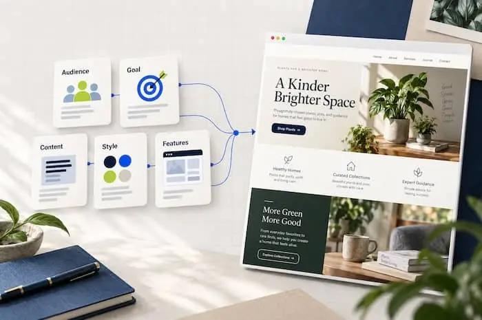
Intro
You open an AI website builder and type: “Build me a modern website for my business.” It sounds like a reasonable place to start. But “modern” leaves a lot open to interpretation. So does “my business.” Who is the website for? What should visitors do? What makes your business worth choosing? Should the design feel quiet and polished, colorful and creative, or practical and straightforward? Without those answers, the builder has to fill in the gaps. You might get a working website, but the design, copy, and structure may have little connection to your business. Before you ask AI to build your website, give it a brief. You don’t need a lengthy document or a background in design. You need enough direction to help the builder make useful decisions. Here’s what to include.
Explain what your business does—in plain language
Start with the facts a new customer would need to understand your business. Include: Your business name. What you sell or provide. Where you operate, if location matters. What makes your approach different. Any important limits on what you offer. Avoid describing your business entirely with phrases like “innovative solutions” or “exceptional service.” Those could describe almost anyone. For example, this gives the builder very little: We’re a premium landscaping company dedicated to excellence. This gives it something to work with: Evergreen Yard Co. provides recurring lawn care and seasonal yard cleanups for homeowners in Portland. We specialize in smaller residential properties and offer straightforward monthly pricing. We don’t provide landscape architecture or major construction. That explanation helps guide the headlines, service sections, imagery, and inquiries the website should encourage.
Describe the person you want to reach
“Everyone” isn’t a useful audience description. A website for busy homeowners needs different messaging from one for property managers—even if both audiences buy landscaping services. Describe your ideal visitor by answering three questions: What are they trying to get done? What is making that difficult? What would help them feel comfortable choosing you? For our landscaping example: Our ideal customer is a busy homeowner who wants a tidy yard without spending weekends maintaining it. They worry about unreliable contractors, surprise charges, and having to chase someone for updates. They want clear pricing, dependable scheduling, and an easy way to request service. Now the builder has reasons to emphasize reliability and explain the process. “Beautiful outdoor spaces” alone wouldn’t address those concerns.
Choose the website’s main job
Your website can serve several purposes, but it needs a clear priority. Do you want visitors to: Request a quote? Book an appointment? Buy a product? Start a trial? Browse templates? Read articles and join your email list? Choose one primary action and, if needed, one secondary action. For example: The primary goal is to get homeowners to request a lawn-care quote. The secondary goal is to help them understand our services and coverage area. This gives the builder direction for the page structure and buttons. Also explain what happens after someone clicks. Does “Request a Quote” open a form, start an email, or take visitors to a booking service? A button label is only part of the instruction. Its destination matters, too.
Provide the content you already have
Real content helps determine the layout. A short service description might work well in a compact card. A service that needs eligibility details, pricing explanations, and frequently asked questions may need its own page. Gather whatever you already have: Service or product descriptions. Pricing and package details. Your logo and brand colors. Photos you have permission to use. Contact information and business hours. Genuine testimonials. Frequently asked questions. Booking, checkout, or social links. You don’t need everything finished before you begin. Just distinguish confirmed information from missing information. A useful instruction is: Use the supplied business details as the source of truth. Where information is missing, insert a clearly labeled placeholder for review. Do not invent testimonials, certifications, client logos, statistics, or business claims. A polished layout should never make a made-up claim look official.
Describe the visual direction with specific examples
“Make it look professional” expresses a goal. It doesn’t explain the design. Give the builder more concrete direction: Use a warm, uncluttered design with cream backgrounds, dark green headings, readable typography, and real residential yard photography. Keep decorative elements minimal. The website should feel approachable and established. You can also supply two or three reference websites or screenshots. Explain what you like about each. For example: I like the generous spacing in the first reference, the service layout in the second, and the photography style in the third. Use those qualities as inspiration while creating an original design. If your builder cannot access a reference link, provide screenshots or describe the relevant details. Tell it what to learn from the reference. Otherwise, it has to guess whether you like the colors, layout, typography, or all three.
Outline the pages and information visitors need
You don’t have to design every section yourself. But you should identify what visitors need to know before they take action. For a small service business, that might include: Home: What you do, who you help, why choose you, and how to get started. Services: What each service includes and who it suits. About: Your background and approach. Contact: Your contact details and an inquiry form. Then explain any priorities: Show our service area near the top of the homepage so visitors can quickly check whether we cover their neighborhood. You can ask the builder to recommend a structure first: Before building, propose a page outline based on our audience and main goal. Explain the purpose of each section and flag anything that needs more information. Reviewing a short outline is easier than untangling a complete website built around the wrong assumptions.
Specify what needs to work
A website can look finished while important functions are still missing. List the behavior you expect: Where forms should send submissions. Which fields a form needs. What happens after a successful submission. How appointment booking works. Where purchases or payments happen. Which content you need to edit yourself. Be explicit about what is ready now and what still needs connecting. For example: The quote form should collect name, email, ZIP code, and requested service. The submission destination has not been chosen yet. Clearly identify that setup as unfinished, and do not display a success message unless the submission actually succeeds. Also include basic usability requirements: readable text, clear form labels, keyboard access, visible focus indicators, and layouts that work on phones. These requirements give you something concrete to review when the first version is ready.
Set boundaries for the first version
Build the public business website first. Online payments, customer accounts, and a customer dashboard are outside the scope of this version. If you’re updating an existing site, identify anything that must be preserved, such as working forms, page URLs, content, or integrations. If the site needs a particular platform or hosting setup, include that too. If you’re unsure, ask for a recommendation before implementation and explain how you plan to maintain the site.
Copy this brief before your next build
Fill in what you know. Leave the rest marked as undecided. Business name: [Name] What we do: [Explain your products or services in plain language.] Ideal visitor: [Who they are, what they need, and their main concerns.] Primary website goal: [The most important action visitors should take.] Secondary goal: [Optional supporting action.] Pages and essential information: [List the pages and details visitors need.] Available content and assets: [Copy, logo, photos, prices, contact details, and genuine testimonials.] Visual direction: [Colors, typography, imagery, mood, and specific preferences.] References: [Links or screenshots, with an explanation of what you like.] Required functionality: [Forms, booking, checkout, editing needs, and integrations.] Platform or hosting requirements: [Existing setup, required tools, or undecided.] Scope and boundaries: [What belongs in this version, what can wait, and what must be preserved.] Accuracy requirements: Use supplied facts. Flag missing information. Do not invent reviews, credentials, results, or business claims. First step: Review this brief, flag important gaps, and propose the page structure before building.
Give the builder direction, then room to design
A useful brief doesn’t dictate the position of every image or the size of every heading. It explains what the website needs to accomplish and gives the builder enough context to make sensible choices. You don’t need the perfect prompt. You need a clear business description, a specific audience, a primary goal, and honest content. Before your next build, spend a few minutes gathering those pieces. Then ask AI to turn them into a website. The brief is where your website starts becoming yours.